

GBC Playbook: Volume VI
The Hidden Friction in Your Trading Process - part 1

Why most traders lose efficiency before they ever lose money and how we’re fixing it.
“Artificial intelligence is not a substitute for human intelligence; it is a tool to amplify human creativity and ingenuity.”
Fei-Fei Li

Previous Chapters:

After Chapter 5 of the GBC Playbook, something stayed with us longer than expected. Writing about how we work forced us to look at ourselves with more honesty, and once you do that, it becomes impossible not to notice the friction that quietly exists in the background of everything you do.
At the same time, the world around us felt like it was accelerating. AI tools were appearing one after another, each one more capable, more ambitious, more present in conversations everywhere. It was impossible not to feel both excitement and responsibility, because when technology moves this fast, you have to ask yourself what role you want to play in that shift, and whether you are building something that still makes sense tomorrow.
We also started thinking more deeply about how fragmented trading really is, not only in terms of tools, but in terms of people, strategies, and time horizons. From scalpers to long term investors, from institutional allocators to individual traders, everyone sits somewhere on an enormous spectrum, and we realized that we, as swing traders with a medium term growth bias, are just one small expression of that spectrum.
And then we looked at the tools we use every day, and we saw the same fragmentation reflected back at us. Platforms for charts, platforms for fundamentals, platforms for news, platforms for screening, all stitched together into a stack that works, but never truly feels unified. For years we accepted this as normal, almost as if it were inevitable.
But this time it felt different. The tools exist. The building blocks are available. The only missing piece was the decision to try.
So we decided to build the dashboard we had always imagined, something simple and immediate, designed specifically for swing trading and short to medium term investing, something that works seamlessly on desktop and mobile, and most importantly something that does not require a manual to understand.
We wanted clarity, not complexity, signal, not noise.
We started working on it in our free time, during evenings and weekends, without knowing exactly how long it would take, but driven by the feeling that it was finally time to stop waiting for the perfect tool and instead try to create it ourselves. The effort has been significant, far more than we anticipated, yet the early results have given us genuine confidence that this can become something meaningful.
It is still early, and we need a bit more patience before release, but the first version will be shared with our paid subscribers, included in their subscription, so they can help us refine it with real feedback, and after that we will gradually open a small beta batch for the first people on the waitlist.
This project began with curiosity, but it is growing through effort and shared belief.
The Data Partnership Behind Our Platform
Very early in the process we understood that building a serious product meant making serious choices.
Data today is the backbone of any trading application. It is not an accessory, it is not a feature, it is the core layer upon which everything else rests. Accuracy, historical depth, real-time updates, structured delivery, all of these elements determine whether a tool feels reliable or fragile.
For that reason, we decided to partner with Financial Modeling Prep, a company that has quietly become a trusted pillar for over 400 financial and technology organizations worldwide, including global banks, hedge funds, consulting firms, and digital investment platforms.
What impressed us was not only the breadth of their data, but the philosophy behind. FMP was founded by professionals with deep roots in financial services, trading systems, analytics, and investment management, and that experience shows in the way their infrastructure is built. Their institutional-grade architecture delivers high-quality real-time and historical financial data within milliseconds, while maintaining flexibility and transparent pricing that supports innovation rather than restricting it.
If we had relied solely on free data sources, the result would have been slow, fragmented, and structurally limited. It might have been functional, but it would not have been professional. And when you are building for traders who operate with discipline, who manage risk carefully, and who depend on timely information to execute momentum-based strategies, “functional” is not enough.
This collaboration is a reminder that meaningful projects are rarely built alone. Our effort, our nights and weekends, our obsession with simplicity and clarity, needed to be matched by a partner capable of delivering the data backbone at the highest standard.
Together, the vision becomes realistic.
Together, the ambition becomes executable.

Clarity Over Noise
This is where things start to get interesting.
Before diving into the details, it’s worth stepping back to explain how the platform was conceived and who it is truly built for. The goal was never to create the next Bloomberg Terminal. There are already powerful tools designed for institutional investors and professional analysts. That is not the space we are trying to occupy.
Instead, this platform was designed with a very specific kind of user in mind: the individual trader focused on swing trading and momentum investing. Someone who doesn’t need endless dashboards, thousands of indicators, or a constant stream of market chatter. Someone who needs clarity.
Modern markets suffer from an excess of information. News, signals, opinions, metrics, charts, alerts. The sheer volume can make even experienced traders feel overwhelmed. Our philosophy is the opposite of most platforms: reduce rather than add. Focus instead of expansion.
The idea is simple in principle but difficult in execution. Offer a small set of features, carefully built, that deliver exactly the data needed to construct a strong portfolio of stocks—both from a fundamental and a technical perspective. Nothing more.
In a world drowning in information, clarity becomes a competitive advantage. By filtering the noise, the goal is to help traders reach a deeper level of awareness before they ever open a position.
After all, the simplest things are often the best. But simplicity is demanding. When there are only a few elements, each one has to be built with absolute precision.
Capital Flow: Reading the Market at a Glance
The first page of the platform is called Capital Flow, and its purpose is simple: understand where institutional money is moving, in real time, with a single glance.
Financial markets generate an overwhelming amount of information every second. Charts, indicators, macro data, news, opinions. Most platforms respond by adding even more layers of complexity. Our approach is the opposite. Capital Flow is designed to strip away the unnecessary and surface only what truly matters: the direction of capital.
Everything on this page is organized to answer one essential question as quickly as possible: what kind of market are we trading in today?
Market Indices
The first section presents the main market indices. There are many more we could have included, but we deliberately kept the selection minimal to preserve clarity.
Each index serves a specific purpose.
S&P 500 represents the broader market and the traditional sectors that drive institutional allocation.
Nasdaq 100 reflects the technology and innovation-heavy side of the market.
Mid-cap and small-cap indices (S&P MidCap and Russell 2000) help monitor changes in institutional risk appetite. When money starts flowing into smaller companies, it often signals increasing confidence in the market environment.
Bitcoin acts as a proxy for risk-on sentiment. While not a traditional equity indicator, it often moves in tandem with speculative capital.
The Volatility Index (VIX) gives immediate feedback on fear and uncertainty.
US Treasuries provide insight into defensive positioning and capital seeking safety.
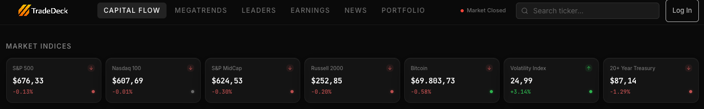
In theory, this section could contain dozens of additional indicators: commodities, precious metals, oil, global indices, more cryptocurrencies. But the goal here is not completeness. It is clarity. These instruments alone already provide a surprisingly accurate snapshot of the market’s risk environment.
Each card communicates two layers of information.
The small arrow indicates the immediate direction of the index during the current session, giving a quick bullish or bearish signal.
The colored dot in the bottom corner goes a step further. This indicator is powered by our proprietary trend algorithms and summarizes the structural condition of the index:
Green signals a bullish trend
Red signals a bearish trend
Grey signals a sideways market
This means that without opening a single chart, you can already understand the broader environment. If most indices are green, the market is healthy and traders may consider taking more risk. If red and grey dominate, caution becomes the better strategy.
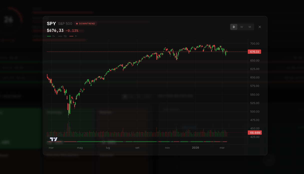
For users who want more detail, clicking on any card opens a dedicated chart view. There you can switch between daily, weekly, and monthly timeframes, with candlesticks, volume, and our proprietary trend indicator displayed directly under the price action. The same trend signal represented by the colored dot on the card becomes a continuous line beneath the volume, making the direction of the trend even clearer.
The goal is always the same: make trading decisions more systematic and less emotional.
Market Quality
The second block moves from surface-level observation to a deeper evaluation of the market’s internal health.
Instead of looking at a few indices, Market Quality aggregates data from the entire universe of listed stocks, combining price behavior, volume, and multiple structural metrics. The result is a single market quality score from 0 to 100.
This score is generated by an internal algorithm built on roughly 30 different market rules, organized around four core pillars:
Trend
Momentum
Breadth
Strength
At first glance these concepts may seem similar, but in practice they measure very different aspects of market behavior. Trend captures direction, momentum captures velocity, breadth measures participation across stocks, and strength evaluates the resilience of price structures.
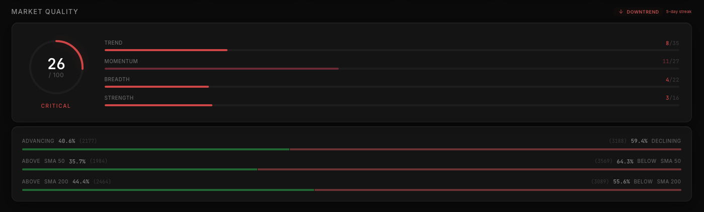
The combined score gives an immediate sense of how healthy the market really is.
In the example shown in the interface, the market score sits at 26 out of 100, signaling a fragile environment. The system also highlights a five-day streak of deteriorating conditions, suggesting that overall market quality has been weakening.
Yet the breakdown reveals something interesting: momentum remains relatively strong. This combination often indicates a highly volatile market, one where large moves occur, but the underlying structure is unstable.
Looking further down, the advancing vs declining stocks, along with the percentage of stocks above their 50-day and 200-day moving averages, provide additional context. In this case, the broader universe of stocks is not collapsing entirely. Instead, the market appears choppy and selective.
This type of environment can still offer opportunities, but it requires a different approach: smaller position sizes, faster trade management, and a higher degree of selectivity.
On the right side of the panel, the system also identifies whether the market is currently in an uptrend, downtrend, or sideways phase, along with the current streak in that direction. While this is not meant as a timing tool, it helps traders contextualize the environment.
Extreme streaks—either strongly bullish or deeply bearish—often precede powerful mean-reversion moves. Simply being aware of these conditions can help traders interpret the broader market.
Market Heatmap & Sector Rotation
Once the overall market environment is clear, the next logical step is understanding where capital is concentrating.
The Market Heatmap provides an immediate overview of sector performance. Instead of scanning hundreds of stocks individually, traders can quickly see which areas of the market are leading and which are lagging.
Performance can be viewed across multiple timeframes:
Daily
Weekly
Monthly
Year-to-date
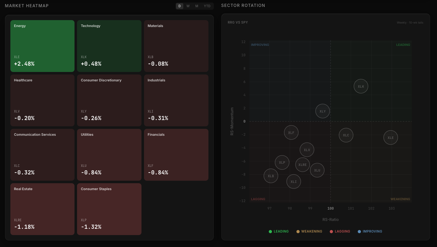
Clicking on any sector opens a deeper view showing the industries within that sector, complete with their own heatmaps and a sector-level price chart with our trend analysis applied.
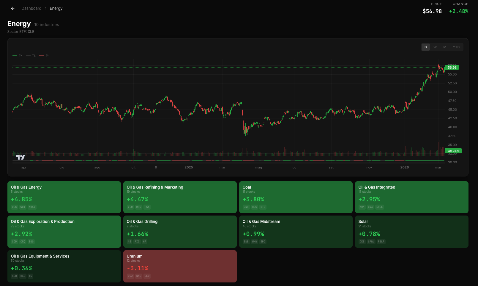
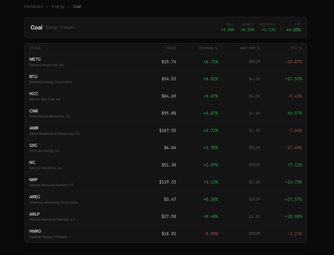
From there, users can drill down even further by selecting a specific industry, revealing the list of all stocks within that group.
But raw performance alone does not tell the whole story. A sector might have performed well recently while actually losing momentum, or vice versa. That’s why we integrated a Sector Rotation view.
Sector rotation has become somewhat fashionable again in recent years, but it remains surprisingly underused by many traders. For swing trading in particular, it can be extremely valuable.
Markets constantly reallocate capital between sectors. Understanding whether a sector is gaining or losing strength relative to the rest of the market can help traders decide when to reduce exposure or rotate into stronger opportunities.
Even a strong stock tends to struggle if its entire sector is weakening.
Industry Performance
The final section pushes this analysis one level deeper.
Here we display the Top 10 and Bottom 10 performing industries across the entire market, again selectable across daily, weekly, and monthly timeframes.
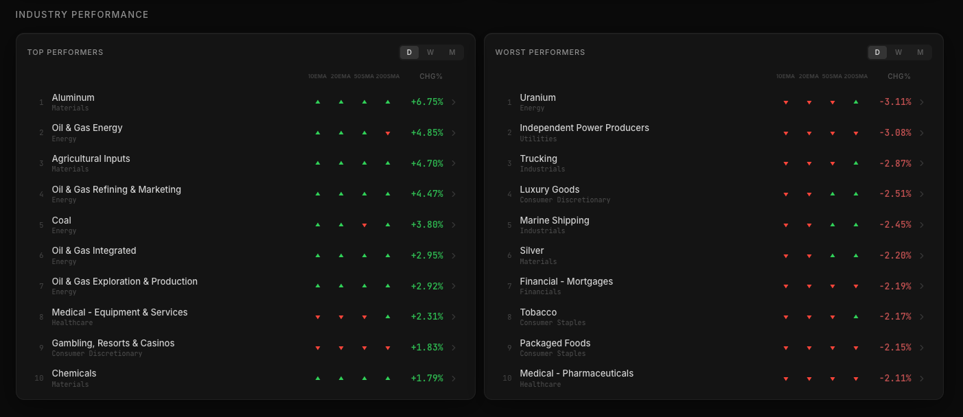
To add another layer of context, each industry is evaluated relative to key moving averages: 10 EMA, 20 EMA, 50 SMA, and 200 SMA.
A green arrow indicates the industry is trading above the relevant moving average.
A red arrow indicates it is trading below.
This simple visual cue allows traders to quickly determine whether strong industries are also structurally trending, or if they are simply experiencing a short-term bounce.
Sometimes the strongest industries belong to sectors already in powerful trends, confirming sustained momentum. Other times, strong industries begin to emerge from sectors that have been heavily beaten down. Those early shifts can signal the birth of new trends, something that would be much harder to identify without this additional layer of analysis.
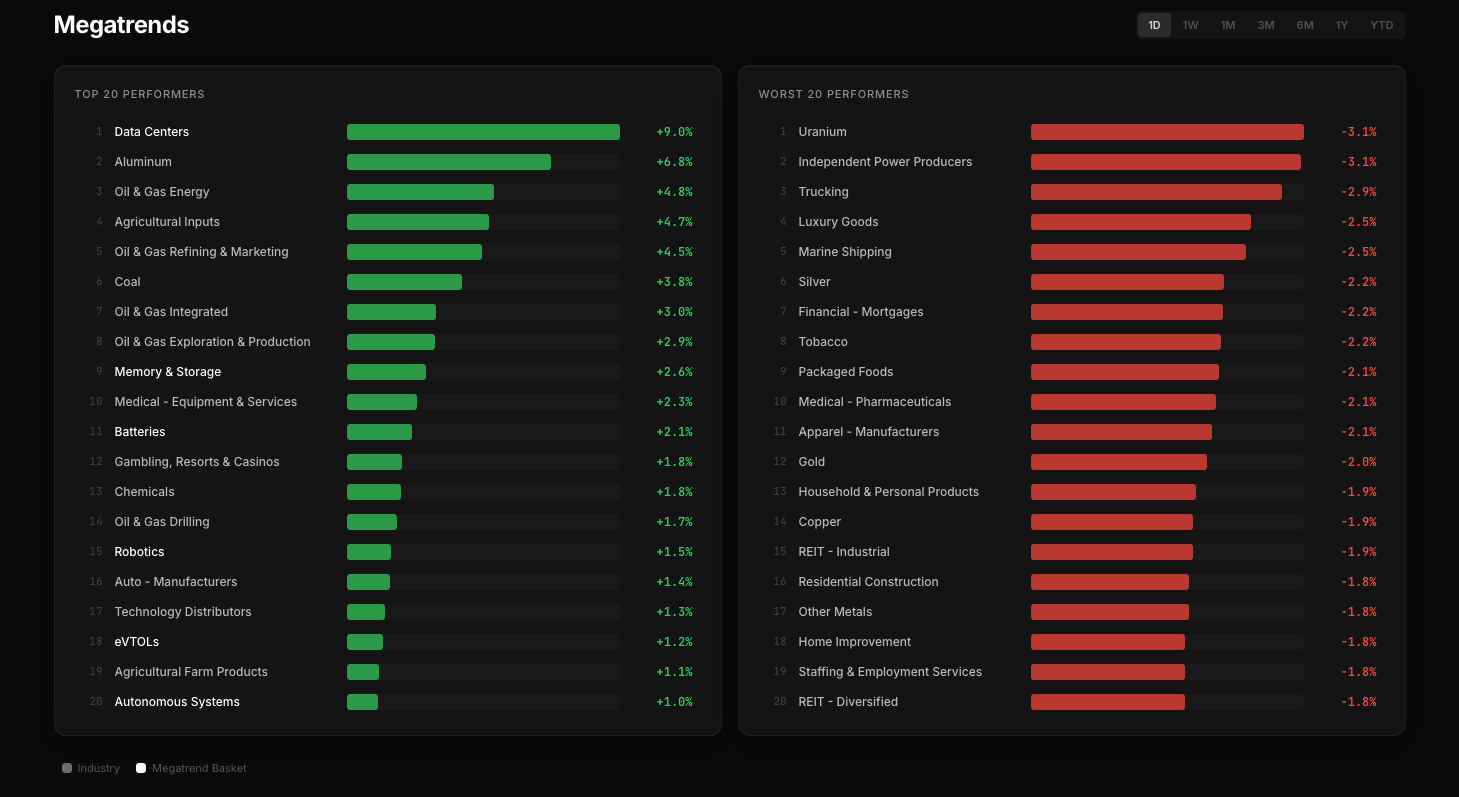
Megatrends: Finding the Forces That Actually Move the Market
If the Capital Flow page answers the question “what kind of market are we in?”, the Megatrends section answers the next logical one:
Where is the real performance happening?
Markets are rarely driven evenly across all sectors. Capital tends to concentrate in specific industries and thematic narratives, sometimes for months or even years. Identifying those pockets of strength early is one of the biggest advantages a swing trader (or even a long-term investor) can have.
This section was designed to make those shifts immediately visible.
Industry Performance (Again?)
At the most basic level, the page shows the Top 20 and Worst 20 performing industries over a selectable time horizon.
Instead of being limited to a single timeframe, users can explore performance across multiple periods:
Daily
Weekly
Monthly
Quarterly
6 Months
1 Year
Year-to-date
This flexibility is crucial. An industry that looks weak on a daily basis might still be leading over a six-month period, while a short-term outperformer might simply be experiencing a temporary bounce.
The goal is to reveal persistent strength and weakness, not just momentary price moves.
Industries offer a much more precise lens than broad sectors. While sectors tend to be very general (technology, healthcare, energy) industries capture the actual areas where capital is concentrating.
For example, the technology sector might appear strong overall, but the real leadership might come from a much narrower group. By focusing on industries rather than sectors, the signal becomes far clearer.
The interface intentionally keeps the visualization simple. Each industry is displayed as a performance bar, making it easy to see relative strength and weakness without scanning complex charts.
A single glance is enough to understand which parts of the market are attracting capital and which ones are being abandoned.
Megatrend Baskets
But industries alone don’t always capture the full picture.
Many of the most powerful market moves in recent years have been driven not just by industries, but by themes, structural narratives that cut across multiple sectors.
Artificial intelligence. Data infrastructure. Electrification. Automation.
These forces rarely fit neatly inside a single industry classification.
That’s why we introduced Megatrend Baskets.
A megatrend basket is a curated thematic portfolio, built manually by selecting and weighting the stocks that best represent a specific technological or economic narrative.
Unlike thematic ETFs, which are often constrained by rigid methodologies, these baskets are designed with flexibility and precision in mind. Each stock is chosen deliberately, allowing us to capture the true structure of the theme.
This approach solves several problems that traditional ETFs often suffer from.
First, thematic ETFs frequently arrive too late. By the time a new ETF is launched around a popular theme, the underlying trend is often already well underway, or sometimes even nearing exhaustion.
Second, ETF compositions are not always ideal for traders. They may overweight large, established companies while excluding smaller, more speculative stocks that often generate the strongest momentum moves.
For swing traders in particular, that distortion can hide the real dynamics of a theme.
Our megatrend baskets are designed to reflect the actual leadership inside a narrative, not just the largest companies associated with it.
Discovering Hidden Leaders
One of the most valuable aspects of this page is its ability to surface themes that many investors might not yet be paying attention to.
Most people today understand the connection between data centers and artificial intelligence. The narrative is widely discussed, and the market has already rewarded many of the companies involved.
But fewer investors may realize that one of the strongest-performing areas in recent months has been companies related to optical and photonic technologies, critical infrastructure for high-speed data transmission.
These kinds of emerging themes often develop quietly before becoming widely recognized.
By tracking performance at the industry and megatrend level, the platform helps users spot these structural shifts earlier than they might otherwise.
For a modern investor—whether trader or long-term allocator—understanding these evolving narratives is becoming increasingly important.
Some trends last for a few months. Others shape entire market cycles.
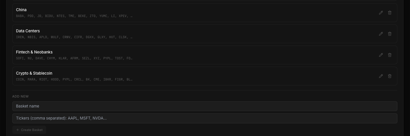
Custom Baskets
Another key feature of this system is flexibility.
While users have access to all the megatrend baskets we curate, they are not locked into them. Each basket can be modified, reweighted, or expanded, and users can also create entirely new baskets based on their own research or thematic ideas.
This allows traders to track narratives that may be particularly relevant to their own strategies.
Some may want to build baskets around AI infrastructure, defense technology, or energy transition. Others may prefer more niche themes that are not yet widely followed.
The system adapts to those needs.
Drilling Down Into the Data
As with the rest of the platform, simplicity does not mean a lack of depth.
Every industry and every megatrend basket can be opened with a single click, revealing the underlying list of stocks along with their performance metrics.
This makes it easy to move from the macro view (identifying where capital is flowing) to the micro level, where actual trade candidates can be discovered.
The result is a workflow that mirrors the way many traders already think:
Identify the strongest themes.
Drill down into the industries driving them.
Find the individual stocks
showing the best momentum.
All without leaving the same section of the platform.
Stock Detail: Where Decisions Are Made
All the previous sections of the platform serve a purpose: understanding the market environment, identifying the strongest industries, and spotting the most promising themes.
But eventually every process leads to the same moment: evaluating a single stock.
That is where the real decision happens.
The Stock Detail page is the core of the platform: the place where all the information needed before entering a trade or making an investment comes together in a single, structured dashboard.
As students of momentum investing, and after studying the work of many of the great traders featured in the classic Market Wizards series, we tried to answer a very simple question:
What do we actually need to know about a stock before taking a position?
Over time, the answer became clear through experience.
Too often we hesitated to take a trade because we didn’t fully understand what a company did. Other times we spent unnecessary time digging through filings to understand the fundamentals. And sometimes the technical picture was unclear: was the stock consolidating properly? Was it a real leader in its industry, or just a temporary mover?
The goal of this page is to eliminate that friction.
Everything that matters is concentrated in one clear dashboard, designed to help traders quickly decide whether a stock deserves attention or can simply be discarded.
To keep the structure intuitive, the dashboard is divided into five main zones, each covering a specific aspect of the analysis.
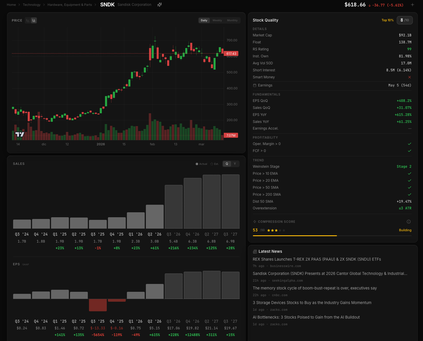
Price Action
In the upper-left section sits the most familiar element: the price chart.
This is a classic chart designed for quick consultation rather than detailed technical trading. For that reason, the available timeframes are limited to daily, weekly, and monthly views.
The purpose is not to replace a full trading platform. Instead, the chart provides immediate context: the overall structure of the move, the broader trend, and whether the stock fits within the type of setups we are looking for.
Momentum traders rarely need more than that first structural overview.
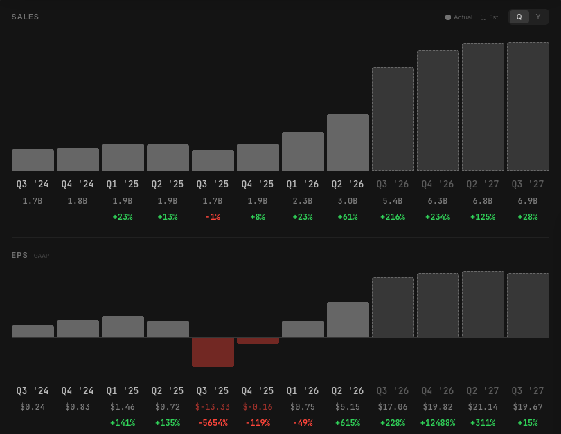
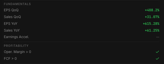
Earnings and Sales Growth
Directly below the chart is the fundamental growth panel, where both Sales and EPS are displayed across multiple perspectives.
Users can quickly review:
Quarter-over-quarter results
Year-over-year growth
Current figures
Forward projections
This allows traders to immediately understand whether the company is expanding its business or simply riding speculative momentum.
While the platform is primarily designed for swing trading, strong price performance is often supported by real underlying growth, and seeing those numbers side by side with price action helps provide important context.
A stock that combines strong technical structure with accelerating fundamentals is often where the most powerful trends emerge.
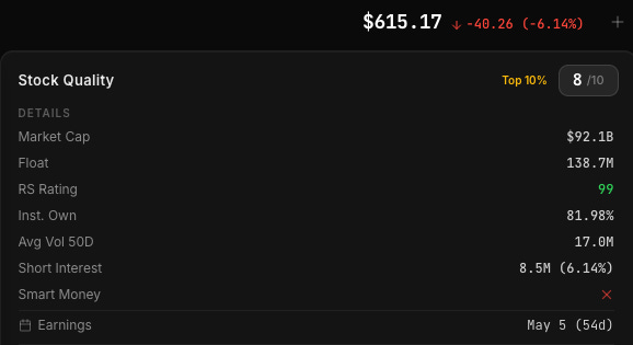
The Stock Quality Score
On the right side of the dashboard sits one of the most distinctive features of the entire platform: the Stock Quality Score.
This is a simple rating from 0 to 10, designed to summarize the overall quality of the stock at a glance.
The score is generated by an internal algorithm that aggregates many of the variables visible throughout the page. It combines:
Technical structure
Fundamental metrics
Industry strength
Megatrend participation
Overall market conditions
Each component is weighted differently to reflect its importance within a momentum-driven framework.
The result is not meant to be a prediction tool, but rather a quick decision filter. Within seconds, a trader can understand whether a stock has the structural characteristics typically associated with strong momentum candidates.
Stocks that stand out as exceptional (both in quality and positioning) receive an additional “Top 10” badge. These represent companies that rank among the strongest opportunities across the platform, often combining superior fundamentals with leadership within a strong industry or megatrend basket.
The score is recalculated daily, ensuring that changes in market conditions or company performance are continuously reflected.
Technical and Fundamental Details
Below the quality score sits a deeper breakdown of the metrics that contribute to the evaluation.
The Details section focuses on the factors most relevant for momentum-oriented traders, variables that historically tend to precede meaningful price movements.
Alongside these technical indicators are several fundamental checkpoints, including two particularly important ones: Free Cash Flow and Operating Margin.
Both are presented as simple yes/no signals, highlighting whether the company meets the minimum thresholds.
Why these two metrics?
Because they offer a surprisingly effective way to filter out fragile businesses.
A company generating positive free cash flow is producing real cash from its operations rather than relying purely on external financing. Meanwhile, a positive operating margin suggests that the company’s core business is economically viable, not just temporarily boosted by accounting adjustments or one-off events.
These two signals together help separate companies that are structurally sustainable from those that are simply speculative stories.
For momentum traders, this matters more than it might seem. Stocks with improving fundamentals tend to attract more institutional attention, which in turn supports sustained price trends.
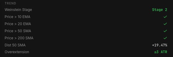
Trend Structure
Momentum strategies depend heavily on trend alignment.
For that reason, the dashboard also evaluates the structural trend of the stock, including its classification within Stan Weinstein’s stage framework.
The system identifies whether the stock is currently in the type of uptrend environment typically associated with stage two advances.
In addition, the page highlights whether price is trading above key moving averages, another essential signal when evaluating trend strength.
The objective is straightforward: momentum traders want to operate in stocks that are already moving in the right direction.
Avoiding Overextended Entries
Even the best stocks can become risky if they are too extended.
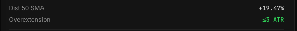
To help traders avoid chasing stretched moves, the platform provides two additional metrics:
Distance from the 50-day moving average
ATR-based extension
These indicators measure how far price has deviated from its recent equilibrium.
When a stock becomes excessively extended, the probability of short-term consolidation or correction increases. Monitoring these values helps traders recognize when it may be better to wait for a pullback, reduce exposure, or lock in partial profits.
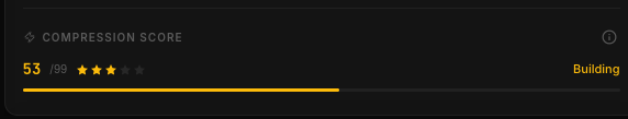
Compression Score
One of the most unique tools in the dashboard is the Compression Score.
This metric is built on an algorithm that analyzes over 50 structural conditions in order to estimate how tightly a stock has been consolidating.
Momentum traders often look for classic technical patterns such as flags, pennants, volatility contractions, and base formations. All of these share a common principle: compression before expansion.
The Compression Score attempts to quantify that concept.
High values indicate that price action has become unusually tight and controlled, conditions that sometimes precede powerful breakout moves.
However, it’s important to interpret this metric with the right expectations. Textbook compressions are rare in real markets, far rarer than many trading books might suggest.
For that reason, scores above 50 or 60 are uncommon. When they appear, they simply highlight situations where the structure deserves closer attention: not a guaranteed breakout.
Like the rest of the platform, the goal is to provide useful context, not rigid signals.
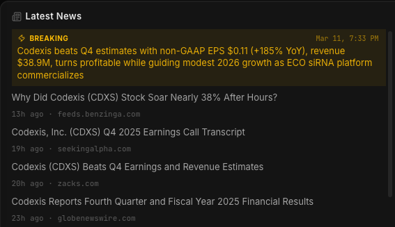
News and Real-Time Awareness
The final section of the page focuses on news related to the company.
Market-moving information can change the entire context of a trade within minutes, so staying aware of relevant developments is essential.
To make this as clear as possible, the system highlights breaking developments with a yellow alert banner that immediately appears at the top of the news section whenever a significant update is detected.
This small visual cue ensures that when opening a stock’s detail page, traders instantly know whether something important has just happened.
Sometimes the most valuable piece of information is simply knowing that there is news, before placing a trade.
At this point, it should be clear that the philosophy behind the platform is simple, but the work behind it is anything but. Each section has been designed with a specific goal: reduce noise, surface what matters, and help traders move from market context to individual stock decisions as efficiently as possible.
That said, there is still a great deal more to cover.
The platform includes several additional tools and layers of analysis that deserve the same level of explanation and context. Rather than rushing through them, we believe it makes more sense to keep things clear and digestible.
For that reason, the full description of the platform will be divided into two parts. In the next section, we will explore the remaining features and tools that complete the ecosystem, and how they fit into the overall workflow of identifying, analyzing, and managing high-quality trading opportunities.
This playbook is here to help. If you’re new or still finding your feet, we hope you got real, practical value from it. If you’re experienced, you’ll recognize a lot, but you may still catch a fresh angle, a small tweak, or a subtle shift that makes a difference.
The heart of it is simple: take what speaks to you and make it your own. Trading is personal. We all see the market differently. We move on different timeframes. We carry different risks, routines, strengths, and flaws.
There is no single right way. There is only your way.
Use it to sharpen your process, not to replace it.
Keep what resonates.
Let go of what doesn’t.
Build a style that fits who you are.
That is the most important thing.